Customizing Property Grid Views
There are different situations in OpenPlant Modeler which use a grid display such as the one below is used to view and define properties for support components. The property grid has many options to customize how the fields are displayed.
Use the options in the tables below to customize the grid view.
Grid Filter Options
| Setting | Description |
|---|---|
| Sort Ascending/Descending | Click on a column header to sort the column in either an ascending or descending order. The column will be sorted either alphabetically or in numerical order, depending on the property values in the selected column. |
| Filter Results | You can filter the display in the grid using a couple of different methods:
|
| Navigation Helper Toolbar | The toolbar at the bottom of the grid provides the following options:
|
| Column Edit | The Column Edit option is available from the main tool ribbon and displays the following dialog listing the property columns which display in the Properties grid. The checked items will be editable in the grid, while items that are unchecked will be Read-Only. Once you have made the selections on which items to edit, click OK to apply the changes. |
| Tool Ribbon | The Property Tool Ribbon options are also available to use for the Properties grid. |
 icon in the top right corner of a column header to display a list of sorting options for the column.
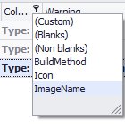

 Append: Puts the focus on the bottom row of the property grid. Type in a property name and define other values for the property. You may also click the Create icon form the Property section of the Tool Ribbon.
  Delete: Removes the selected parameter record from the grid. You may also click the Delete icon from the Tool Ribbon.
  Edit: Changes the selected record to editing mode allowing you to modify it. You can also double click in a field to edit it.
  End Edit: Saves the changes to the property and returns the parameter record to a normal state. This can also be accomplished by click in a different property record, or by selecting the Save icon in the Property section of the Tool Ribbon.
  Cancel Edit: Cancels the current editing process without saving the changes. If you were defining a new record and have not defined the required fields, this option will cancel the edit and the new record will not be saved.
Right-click Sorting Menu
Right-click in any of the column headers to display the following sort menu providing options to control the display of the properties:
| Setting | Description |
|---|---|
| Sort Ascending | Sorts the column data in ascending order either alphabetically or in numerical order, depending on the property values in the column selected. |
| Sort Descending | Sorts the column data in descending order. |
| Clear Sorting | Clears the current sorting option. |
| Group By This Column | Will display the results in groups according to the values of the selected column. The same result can be achieved by dragging a column into the empty area above the column headers as shown below. You can also drag multiple columns into the grouping area to have a hierarchal display of groups in the grid as shown in the image below. To expand a group, click the arrow to the left of it. To remove the grouping, drag the group back into the column header section of the grid. |
| Hide Group By Box | Hides the box mentioned above which allows you to Group by Column using the drag and drop method. |
| Remove This Column | Removes the selected column from the grid display. |
| Column Chooser | Displays the Column Chooser Dialog allowing you to determine which columns to display in the grid. |
| Best Fit | Sizes the selected column to fit the contents. |
| Best Fit (all columns) | Sizes all columns to fit the contents. |
| Filter Editor | Displays the Filter Editor dialog allowing you to modify the existing filter. |
| Show Find Panel | Displays a search field where you can enter specific items to search for. |
| de Auto Filter Row | The grid provide an auto filter row, which allows you to type in a value for any of the grid columns and the grid will automatically be filtered to display records with that value. The Hide Auto Filter Row turns off this option. |
